Creating Layouts for your Page
Most of the common options behave in a very similar manner to the primitive controls. The differences in behaviour are related to the fact that groups are containers, and many of the alignment settings apply to their contents. In addition, you will notice options on the alignment palette for distributing content horizontally and vertically. You can also indicate whether to wrap contents that overflow.
Please see the earlier section on Layout and Control Properties within the Getting Started section for details for details on groups and their role as containers, including information on labels, changing group names and also toggling Design Mode to enable easier visualisation of group boundaries.
Content Labels
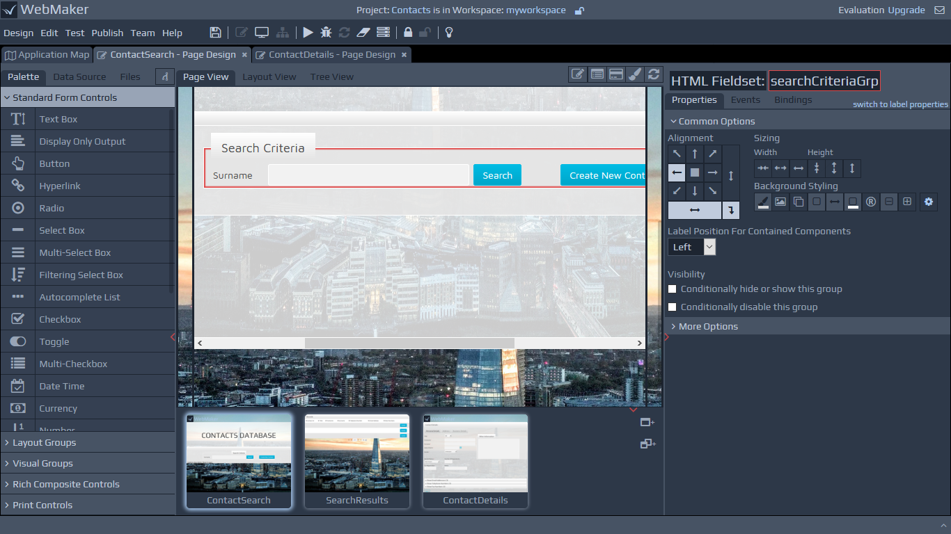
Groups are often used to tabulate data, which might flow horizontally, vertically or in table format. In these scenarios, you may want the labels for the controls, which are contained in these groups, to be on top, on the left, etc. You can indicate this arrangement by using the Label Position For Contained Components option.
Layout Grid
The Grid control can be configured using a number of rows and columns. Each cell can contain other controls, including Layout Groups.
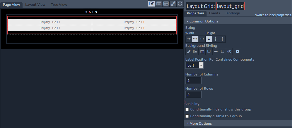 The grid contains options to merge and split cells and options for the addition and removal of rows and columns. You can use the right-click context menu to access most options.
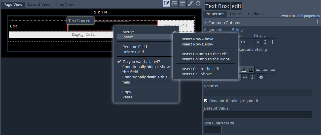
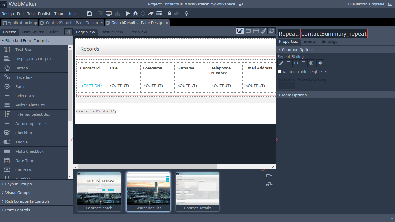
Table within Repeats
Within Repeating Tables, the labels of the contained fields or groups are used as table column headings and the field controls are placed in rows, with a number of rows being determined by the size of the data.
Group Visibility
You can hide, show and disable complete groups of information by using the Visibility options. This operates in a similar manner to the visibility options for controls. You can learn more within the Visibility section in Controls - Common Options.
The following are the common visibility options for groups:
Conditionally hide or show this group - As previously discussed in relation to field visibility, this option allows you to configure conditions, based on the values of other items, to determine when groups should be visible or hidden.
Conditionally disable or enable this group - This option allows you to configure conditions, based on the values of other items, to determine when groups should be disabled or enabled.
Please see the Visibility section under More Options for additional visibility settings.
Group Styling
You can change group backgrounds, set rounded corners, create box shadows, etc.